The Social Tracker Twitter report gives you a handful of ways to analyze you and your competitors on Twitter.
Settings and Navigation
By default, the Social Tracker shows your main company’s data over the past 7 days. These settings can be changed with the blue drop-down or calendar above the report. All of the data in the tool will be based on the company and date range set at the top.
The Twitter report in the Social Tracker is broken into seven subsections: Tweets, Audience, Activity, Engagement, Hashtags, Mentioners, and Mentions. Navigate between the subsections with the sub headers inside the Twitter tab.

Tweets
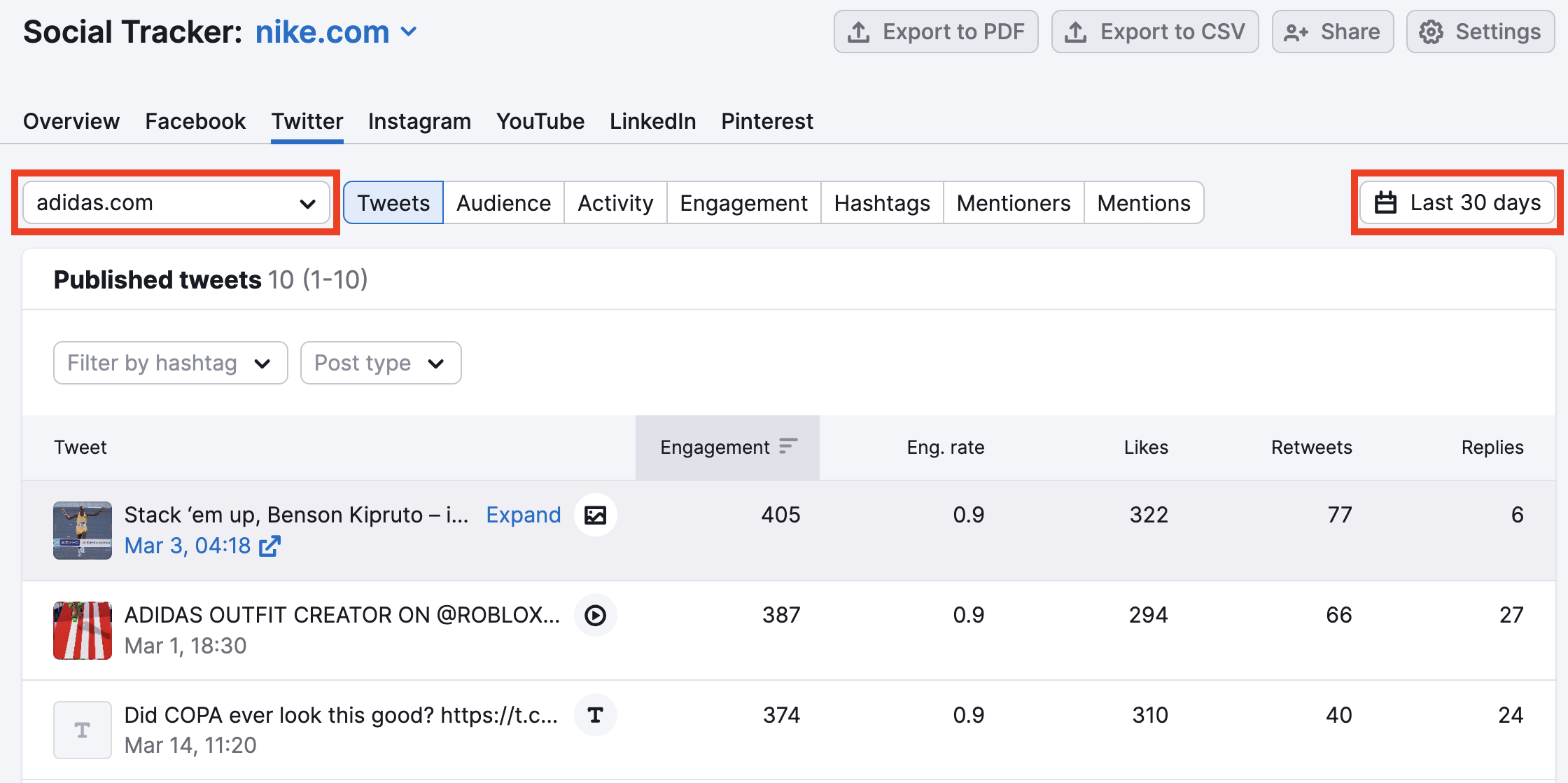
The first way to use the Twitter report is to analyze tweets from you or a competitor. Select a single company in the Company selector to look at one competitor’s tweets, or choose “All profiles” to compare everyone in the project. These settings will dictate the content in your report.
Tweets are listed in the table by their post date with the most recent tweets at the top of the list. The table can be sorted by any of the column headers (total engagement, engagement rate, likes, retweets, or replies) to look for tweets that performed well in different ways.
For example, you can analyze “All profiles,” and sort the column by different metrics to see who out of your competitors posted the most engaging, liked, and retweeted tweets.
Filters
Above the table are two more filtering options; by hashtags or tweets type. Click the field beside “Filter by hashtags” and scroll through all of the hashtags found in the tweets to choose one. The table will show you the exact tweets from your date range that used the hashtag.
The other way to filter the tweets is by their type. The different types of tweets Semrush notices are:
- Photos - a tweet with an image
- Statuses - a tweet with just text and no image, video, or link
- Videos - a tweet with a video
- Links - a tweet with a hyperlink
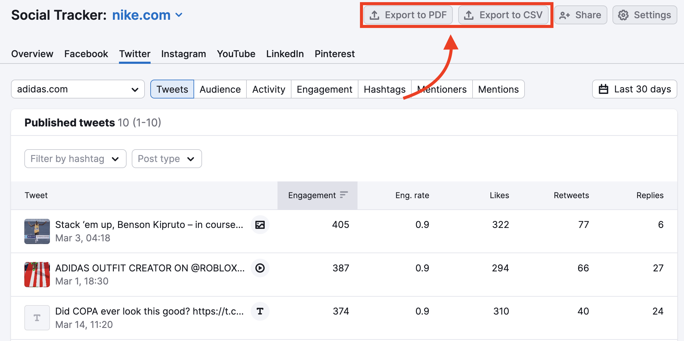
Exporting Tweets
Users can export a list of tweets from this report to a PDF or spreadsheet (CSV) with the settings buttons at the top right of the interface. The selected company and date range will dictate the contents of the PDF. The PDF download will give you the option to email, schedule, brand the report, or create a custom report. Creating a custom report will redirect you to the Report Builder in My Reports where you can fully customize the elements of your PDF report.
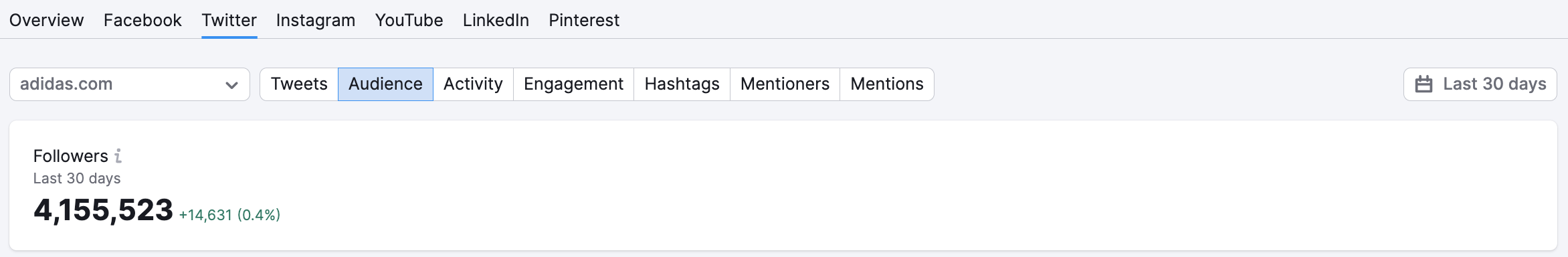
Audience
The next subsection under Twitter allows you to investigate the size and growth of your competition’s Twitter audiences. At the top of the report will be the selected company’s total follower count in the set date range compared to the previous date range. For example, if you set the date range to the past 30 days, your audience as of today will be compared to your audience from 30 days ago. If your date range is set to the past week, your audience size today will be compared to your audience from last week. The amount of change and growth will be indicated in green for a positive change and red for a negative change.
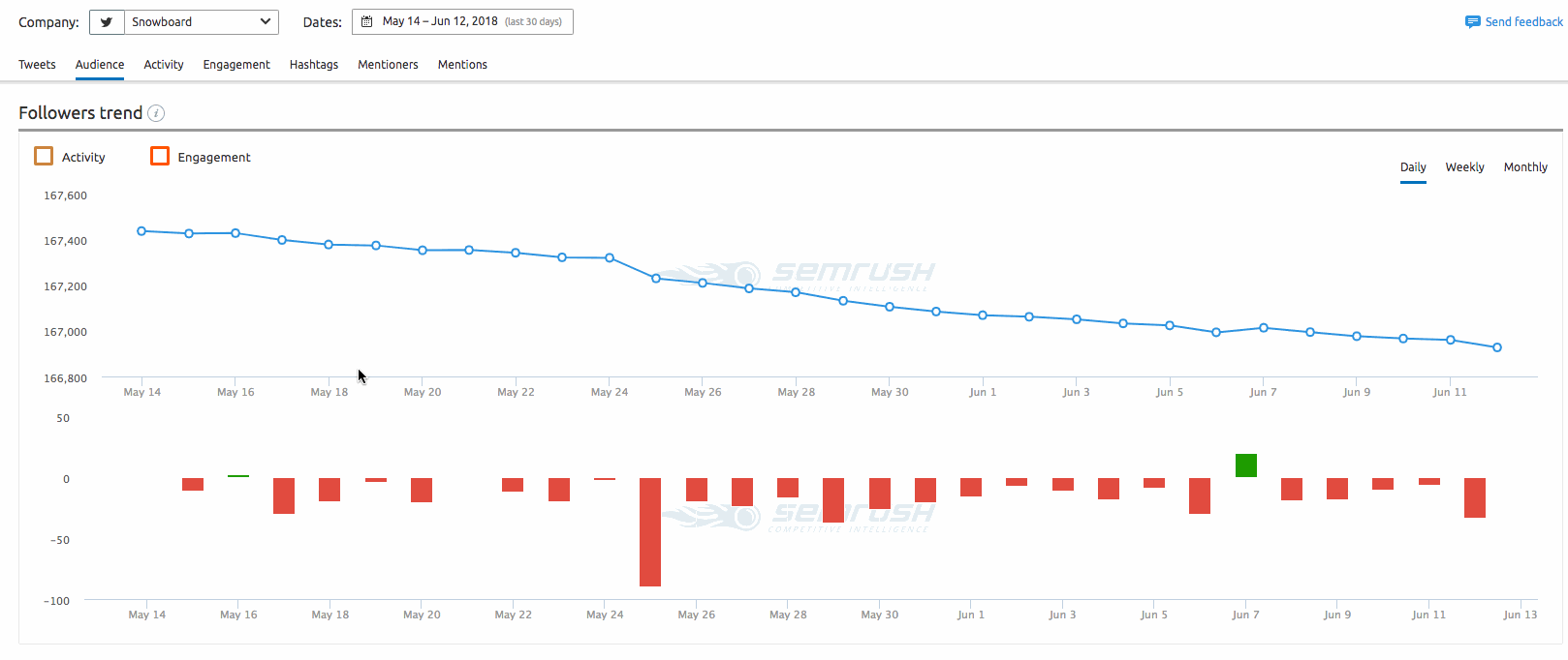
Followers Trend
The next section is where you can analyze the trend of a company’s overall Twitter follower count over time. The graph can be set to plot points on a daily, weekly, or monthly basis. To add Activity and Engagement lines to the graph, simply click the boxes at the top left of the graph.
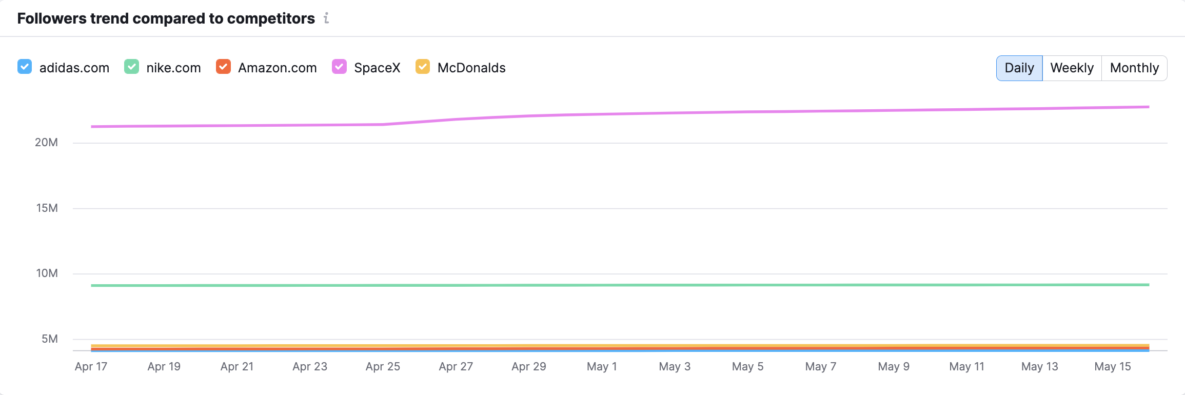
Compared to competitors
The next graph on this page compares the trends of each company’s audience growth. Again, this graph can plot points on a daily, weekly, or monthly basis. To remove any competitors from the comparison, select the colored box from below the graph.
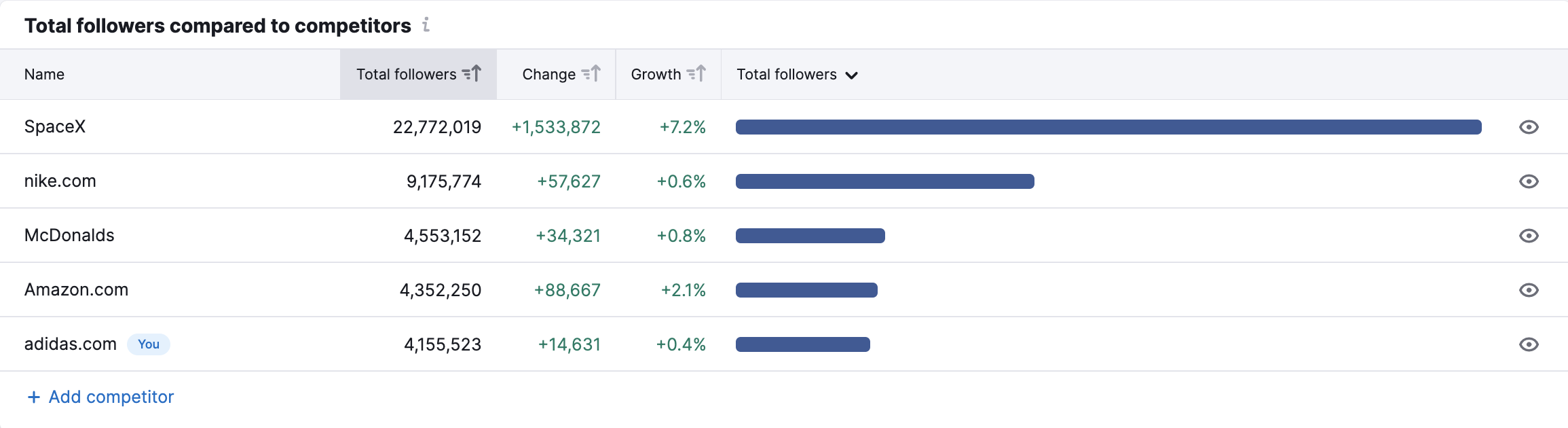
Total followers compared to competitors
The final graph compares the overall audience size of the companies in your project. The change column compares the date range selected at the top of the report to the previous date range. You can sort the competitors in this graph by who has the biggest audience, which audience saw the biggest change, and which audience saw the biggest amount of growth (growth %) relative to their audience size.
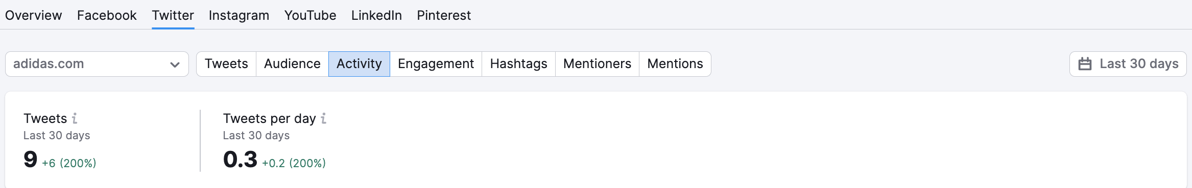
Activity
The Activity section gives you deeper analysis of the behavior of your Twitter competitors. The top of the report has the company’s total number of tweets over the select date range, the tweets per day in that date range, and the change in both metrics compared to the previous range of time. Any increase or decrease in a competitor’s tweeting behavior over the set date range will be clear from this section by the red or green numbers showing change and growth.
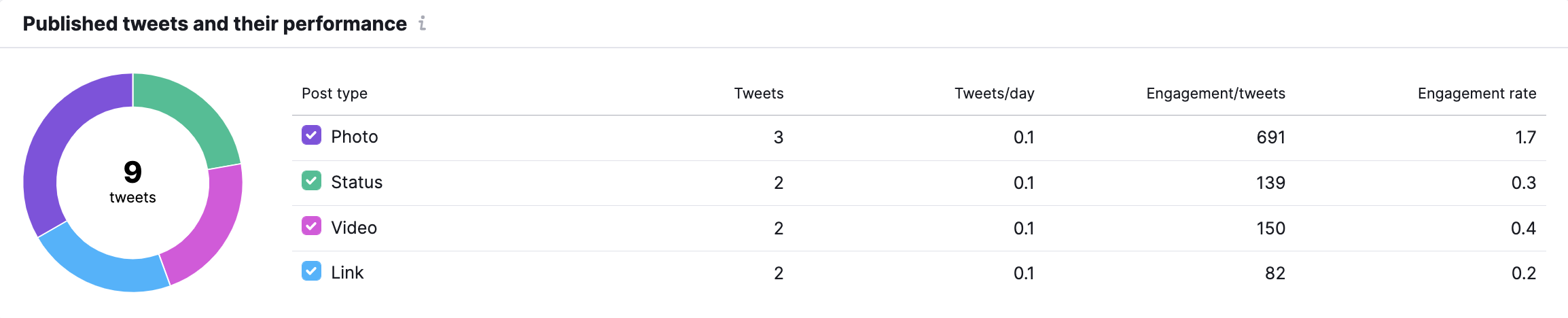
Published posts and their performance
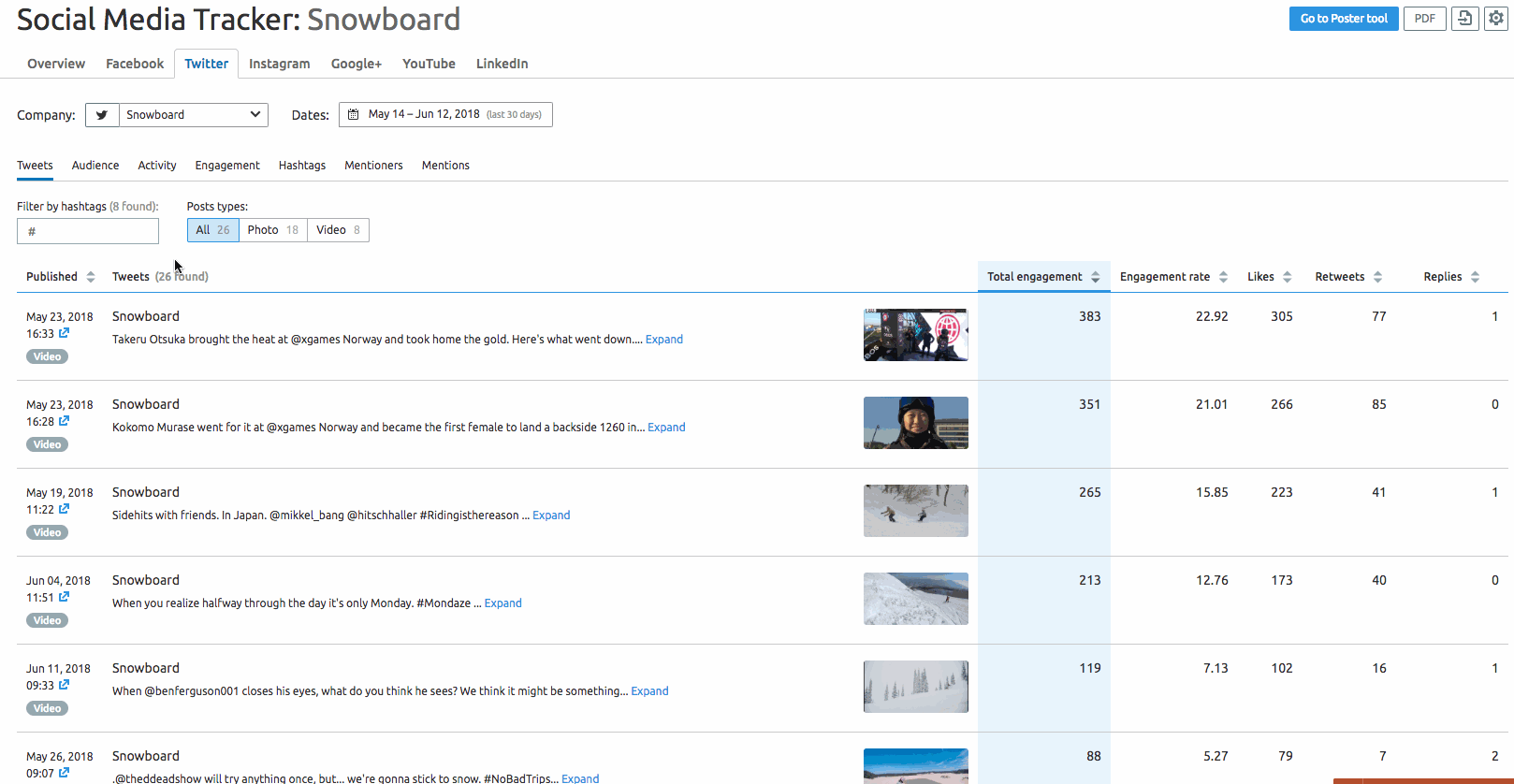
Review this section to discover which type of tweet gets the most engagement out of a competitor’s audience. Here you can compare how often a competitor posted different types of tweets (links, videos, photos, and statuses) and how much engagement each type garnered from their audience. The spread of these different types of tweets will be illustrated in the circle chart to the left. See in the image below how adidas.com saw varying engagement levels for their different types of tweets over the course of 30 days.
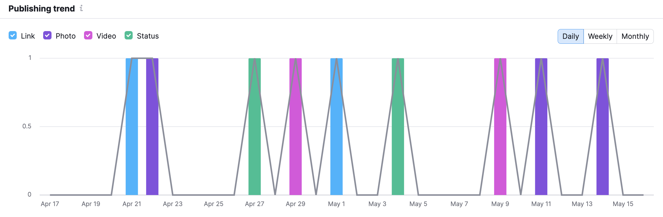
Publishing trend
This graph illustrates a competitor’s tweeting trend over time. Points can be plotted on a daily, weekly, or monthly basis across your selected date range. Each type of tweet will be represented by the colored bars below the blue line.
Publishing trend compared to competitors
The next graph compares the publishing trends of all of the competitors in your project. Again, the lines can be plotted on a daily, weekly or monthly basis. At the top right, you can choose to compare a specific type of tweet. Identify which competitors post the most videos, photos, links or statuses and discover opportunities to try posting different types of tweets.
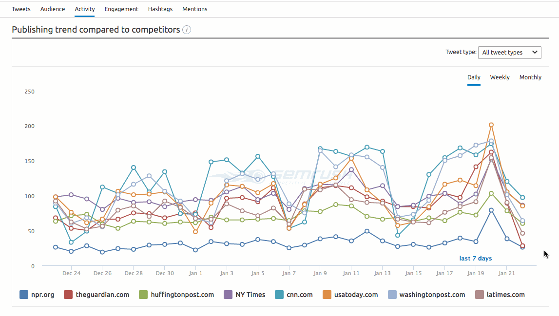
If you want to remove any of your competitors from the comparison graph, simply deselect their colored box below the graph.
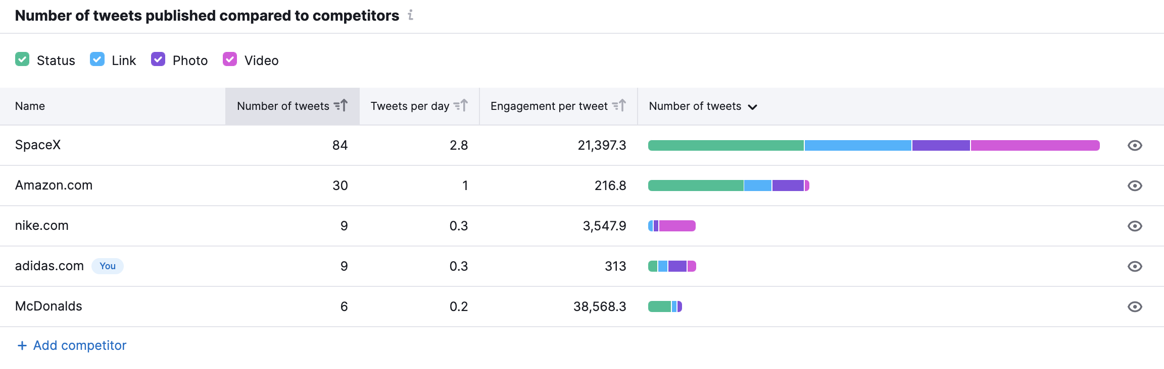
Number of tweets published compared to competitors
Finally, the graph at the bottom compares the total number of tweets that your competitors posted within the selected date range. The competitors can be sorted by their total number of tweets, tweets per day, or engagement per post. If you want to remove any competitors from this comparison, you can use the eye icon to the left of their name.
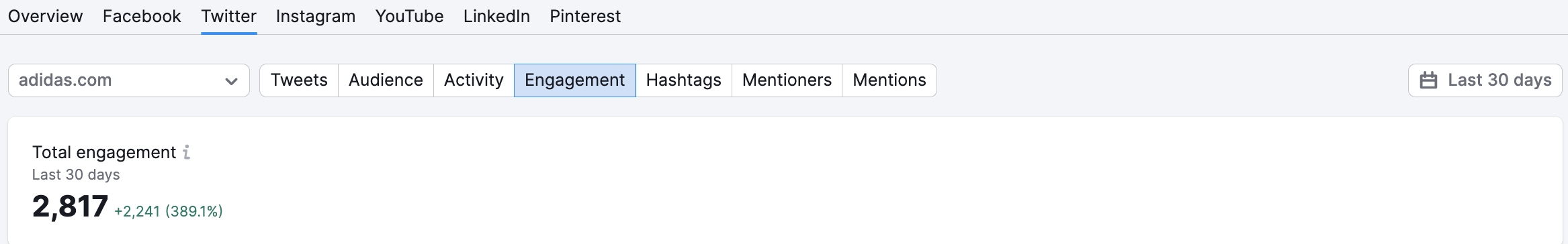
Engagement
The Engagement section will detail how well your competitors engage their Twitter followers. Total engagement on Twitter is calculated by combining the total number of likes, retweets, and replies to a Twitter account over a period of time. The top makes it easy to see if the company has seen a positive (green) or negative (red) change in engagement compared to the previous date range.
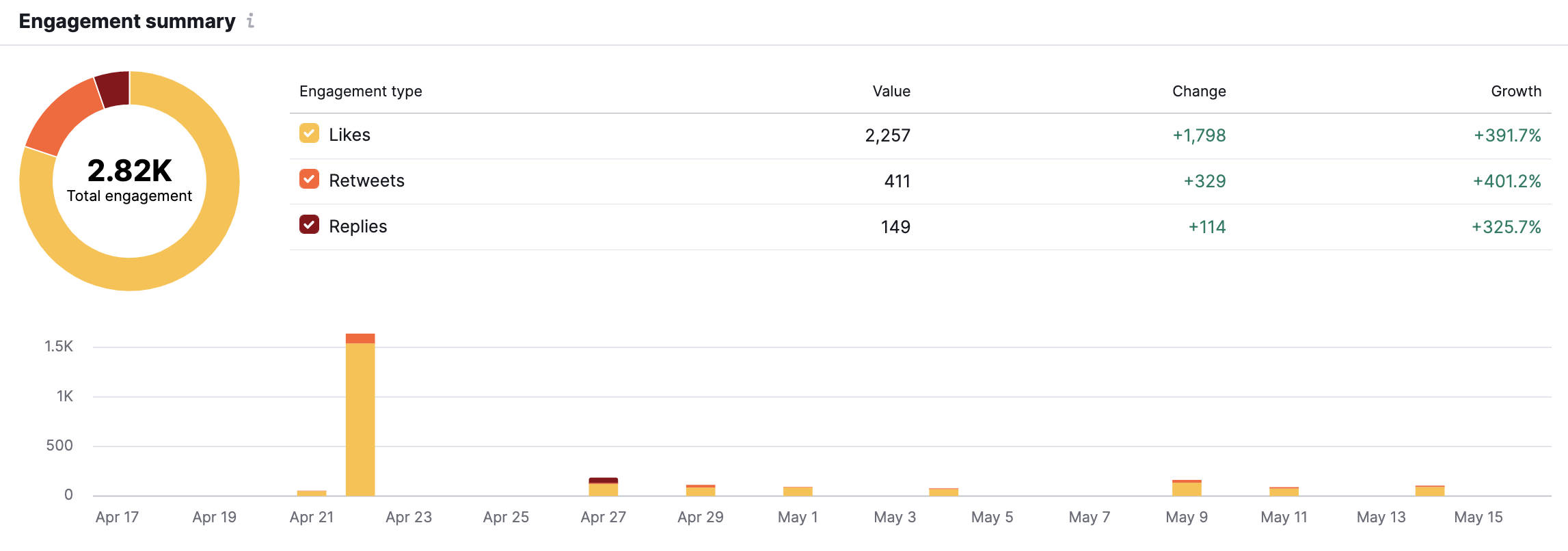
Engagement Summary
Here you can see the total engagement score for a Twitter profile over the selected date range. The circle chart to the left will break the score down by likes, retweets, and replies. For each type of engagement, you can see if the profile saw a positive or negative change over the date range. The bar graphs at the bottom of this section show how much engagement the profile received on a daily basis over your date range.
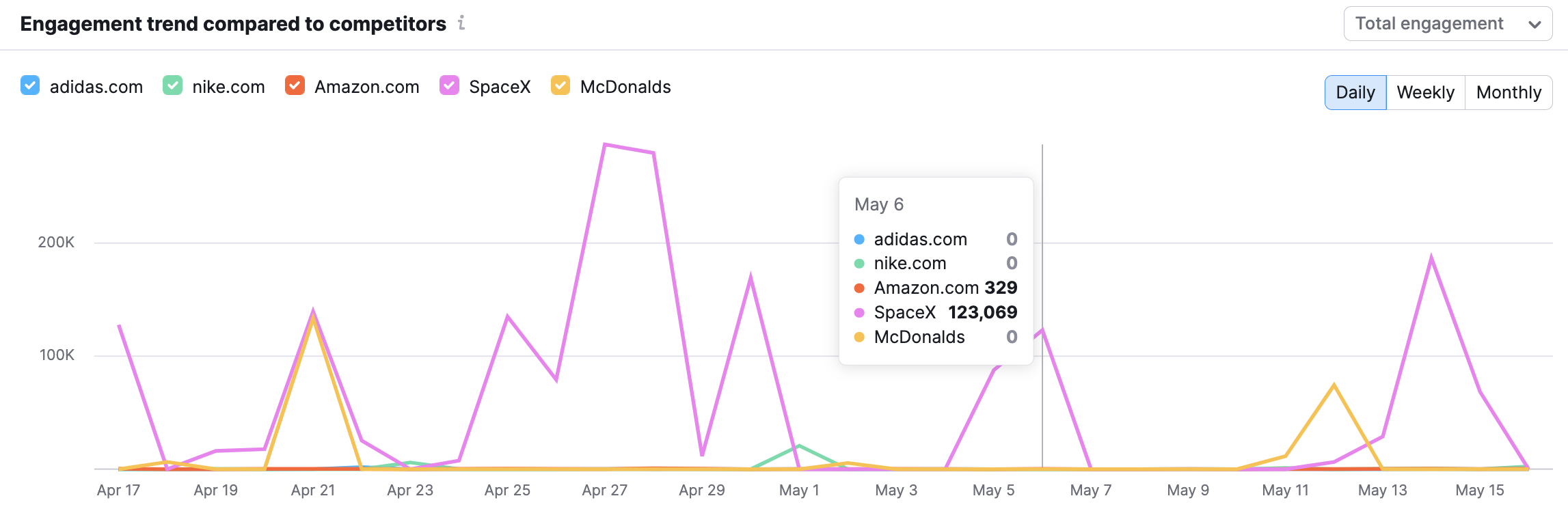
Engagement trend compared to competitors
This line graph compared the engagement trends over time between all of the competitors in your project. This graph can be plotted on a daily, weekly or monthly basis, and can compare the total engagement, likes, retweets, or replies from all of the competitors.
Total engagement compared to competitors
The last graph in this section compares the total engagement levels of your competitors over the selected period of time. You can deselect any individual type of engagement (likes, retweets, or replies) with the colored squares below the graph to hone in on just comparing one or two types of engagement. For example, if you just wanted to compare which profile got the most retweets over the select time range, you would have to deselect likes and replies from the graph.
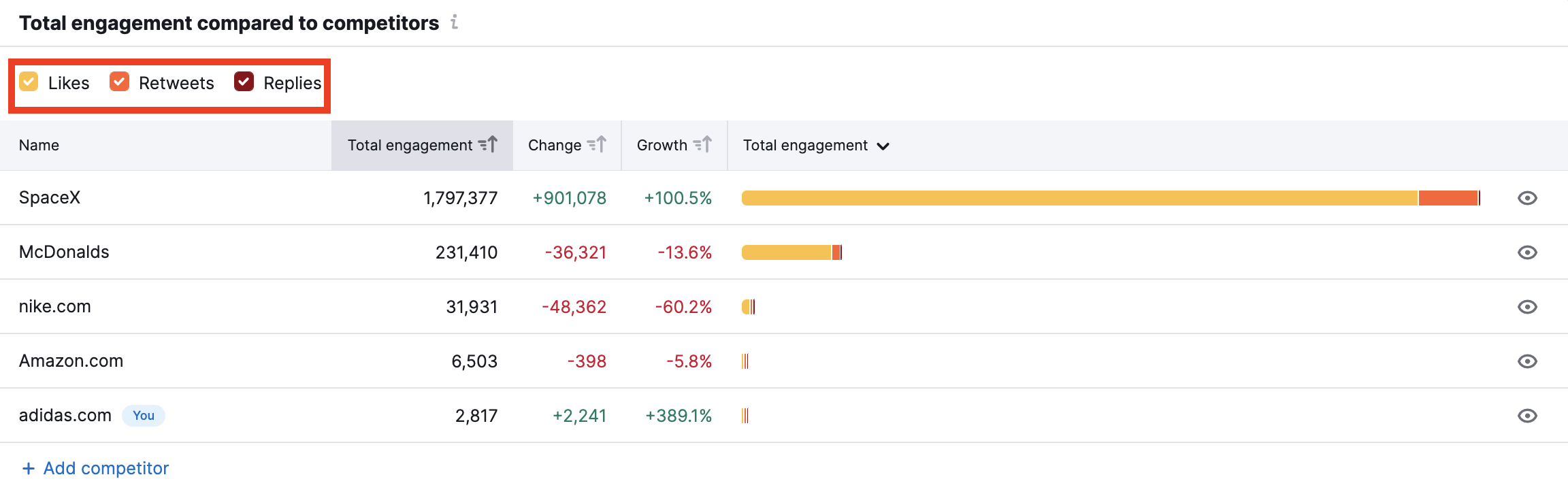 This graph can be sorted by total engagement, amount of change, or growth percentage. Sorting by growth percentage will tell you which competitor is getting the engagement relative to their engagement in the previous time period. If you want to remove any competitors from this comparison, you can deselect them with the eye icons to the left of their names in the graph.
Hashtags
The Hashtags report gives you a list of all the hashtags used by a profile over your selected date range. If you select “All profiles” in the company selector, you can see which competitor had the most success using hashtags to engage their audience.
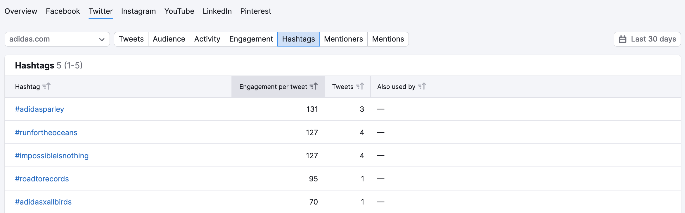
Click on a hashtag to open a pre-filtered Tweets report so you can see the specific tweets that used the hashtag.
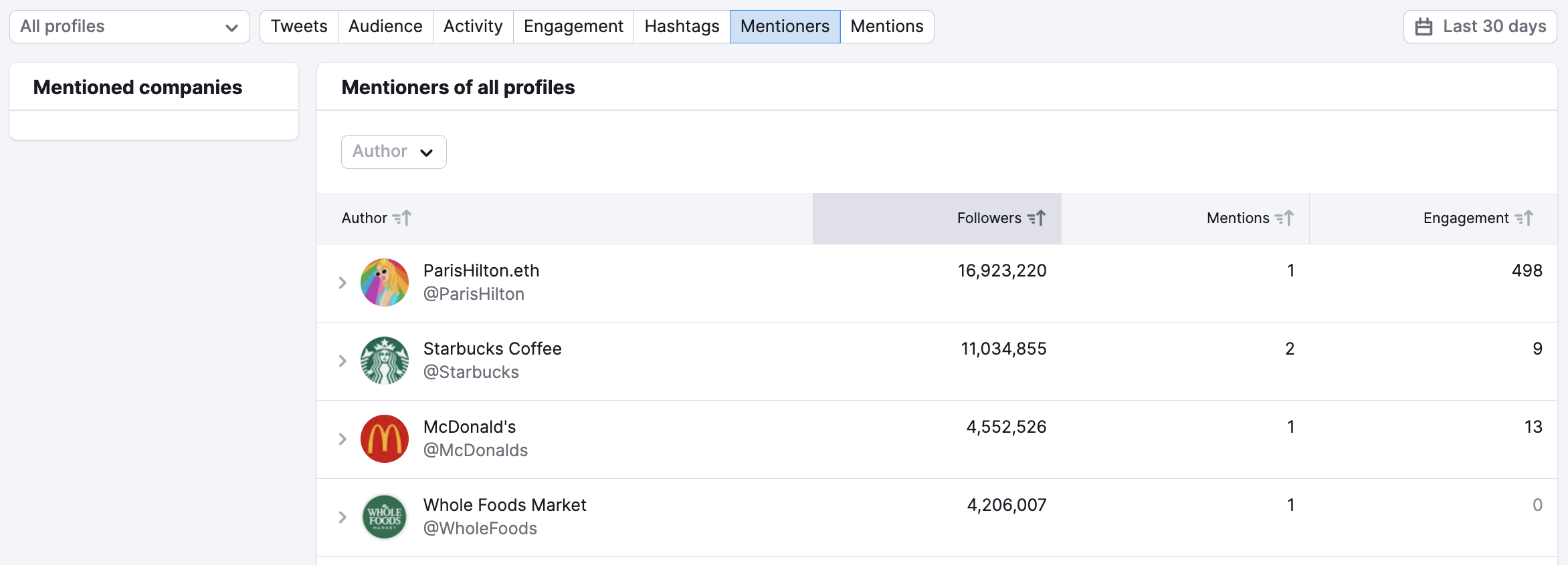
Mentioners
The mentioners tab shows a list of all the Twitter profiles that mentioned your competitors over the set date range. With this report, you can learn if your page is getting mentions on Twitter, if you’re mentioned more often than your competitors, and how actively people engage with the tweets that you and your competitors are mentioned in.
To the left of the table, you can choose the profile you want to see mentioners for or select “All profiles” to see the mentioners for all of the profiles in your project.
Mentions
The last section of the Twitter report allows you to find all of the profiles that mentioned a competitor’s account over your date range. Change the company in the selector and choose a date range to set the parameters for the report and the table will show all of the accounts that mentioned the competitor. Accounts with the most followers are at the top of the table by default, but the tweets can also be sorted by Total engagement, Likes, or Retweets.
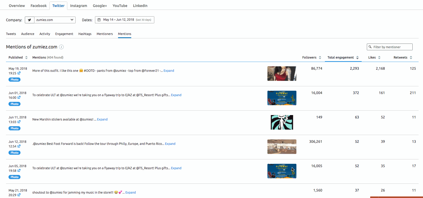
If your competitors are doing any influencer outreach to get mentioned on Twitter by a bigger account, this report will show you how well they’re doing. You can use this list to get ideas for your own Twitter outreach or discover popular accounts that are talking about other companies in your market or niche.
To find a specific mentioner, use the “All mentioners” field and scroll through the list. Select one from the list and see the tweets where they mentioned your competitor.